How to improve conversion for Saber Feedback
January 8, 2021 - Kjell-Åke Gafvelin
When listening to the episode #164: A Saber Feedback update 9 months after acquisition of Steve McLeod’s podcast bootstrapped.fm I was thinking that I might actually have some ideas that could increase customer conversion ratio.
So I deciced to be bold and document my suggestions in a blog post rather than just submit it in a forum. I do give feedback sometimes in forums and on Twitter, but this time it felt right to do it this way.
I am a founder myself of two products, WebMaestro and MSMQ Studio, and now how difficult it is working with SEO and more to drive revenue-generating traffic to your site.
The suggestions that I will describe in this post are the following:
- Intruduce a Free tier instead of a Free Trial
- Improve branding
Introduce a Free tier
A lot of successful founders say that you should stay away from offering a free tier. The reason the give for this is that you will spend to much money on the free tier without actually getting any new paying customers. I agree with this for a lot of services, like API’s or e-mail services, where no-one else than the developer integrating with the services knows who the services provider is.
But for Saber Feedback a free tier could be used as a marketing channel since it is a service which is implemented with a visible widget on a website. In the podcast Steve was talking about getting more back links to the landing page. Since there is already a link to the landing page in the widget, having the widget on a lot of sites means also a lot of back links! People do click on those links as well, I know I have done it a lot of times!
Steve also mentioned that a lot of the free trials did churn because noone had submitted any feedback and therefore didn’t find any use of the service. This is maybe not so strange since the free trial is only 10 days, with possibility to extend. But anyway it might be a too short period to acually find any use of the product since peoples need to submit feedback is most likely less than a lot of other needs.
So a free tier could solve this issue by allowing customer use the widget on their site for an unlimited time. But it is important that the free tier is restricted with clear limits like for example 1 form only, 1 team member, 10 days feedback retention, no custom data, no javascript eventlog. This does not need to be hard limits, but should be measured so it is possible to send e-mails to the customer like “Is it time to upgrade?”.
Improve Branding
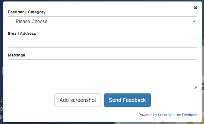
The current feedback widget is very anonymous as is contains almost no branding at all, just a simple HTML link in the bottom right corner.

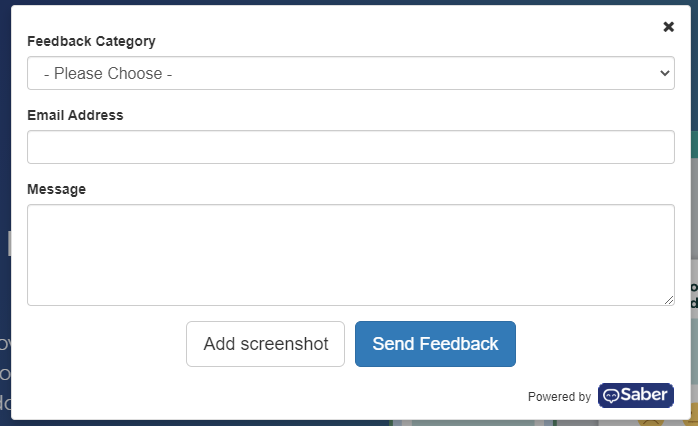
I am no designer, but in a couple of minutes I managed to whip up a small logo and add it to the widget. This way it is easier for the user to recognize who delivered the service. The thing about branding is that the brand must be visible on a lot of places so the user will recognize it.

It is also possible to add more branding to the widget with colors and icons that is used on the homepage as well so the user recognizes it.
If we take a look at Intercom, which is also delivering their service as a widget on the customers home page, and their widget button.

And compare it to their logo we can see the branding in that the “smile” is re-used in the widget without explicitly saying that this is a Intercom widget.

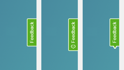
This type of branding could also be possible for the Saber Feedback widget button. In the next image there is the stock button and two alternatives in order from left to right. In alternative 1 I tried to incorporate the owl in the logo and in alternative 2 I made an attempt at including the beek of the owl in the outline of the button.

This was two different possible concepts of including branding in the button. Get a designer to do it and they might come up other alternatives as well. And it will also look better than my attempts…
Branding can be enforced on lower tiers as they pay nothing or not so much for the service, while on the more expensive tiers should be possible to disable the most “visible” branding.
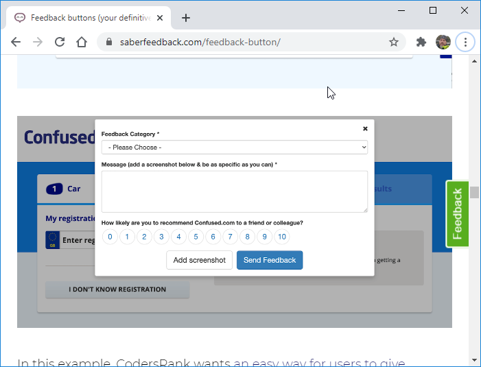
But branding is not only important in the widget, it is also important on the home page. While browsing on the site the logo was only visible on the top or bottom of the page and it was very difficult to find images with any branding. Most images showed an extremely anonymous version of the feedback widget.

Conclusion
Adding a free tier and improve the branding I think could improve the conversion ratio and also the recognition of Saber Feedback. It is not going to be an overnight solution, but like with SEO I do think it will pay out in the long run.
I also have a third idea, but that one will come later…
If you have any comments about this you can find me on https://twitter.com/kjellegafvelin.
My sideprojects
-
SimpleFileDrop
Upload images and transform and serve them via API
-
WebMaestro
Rest API testing tool
-
PricingPageBuilder
Build and A/B-test pricing pages